What is a Landing page?
I’m pretty sure you’ve heard about them, but have you ever created one for your business? If not, why?
A landing page is a standalone page that visitors land on after clicking on an online marketing call-to-action. Each landing is designed for a specific marketing campaign. The purpose of a successful landing page is to grow your audience and convert visitors to customers, perhaps encouraging them to download the app, or purchase your product.
Almost Every Landing Page Consists Of These Elements:
- Your Unique Selling Proposition (USP)
- The main headline
- A supporting headline
- A reinforcement statement
- A closing argument
- The hero shot (images/video showing context of use)
- The benefits of your offering
- A bullet point list summary of benefits
- Benefits and features in detail
- Proof
- Social proof (I’ll have what she’s having)
- Trust indicators
- A single conversion goal – your Call-To-Action (CTA) (with or without a form)
While you may think landing pages are similar to homepages, but they serve different purposes. While a homepage constitutes the start of a visitor’s journey the landing page is designed to promote a specific product/service and to give an overview of that particular service/product with the aim of selling or capturing leads.
Ways of Using Landing Pages:
To collect personal information (generate leads) in exchange for:
- Report/Whitepaper with important industry facts and statistics.
- Ebooks for comprehensive guides about different aspects of your business vertical.
- Newsletters with tips related to your area of expertise.
- Podcasts for people who like to listen and learn during a commute or workout.
- Checklists/Scorecards for people that like to see how well they are doing and/or benefit from a to-do list.
- Blog subscription to receive ongoing content via email or RSS.
- Webinar registration for live online sessions, often with Q&As with experts and special guest presenters.
- Presentations or recorded sessions including video or slides.
- Consultation services
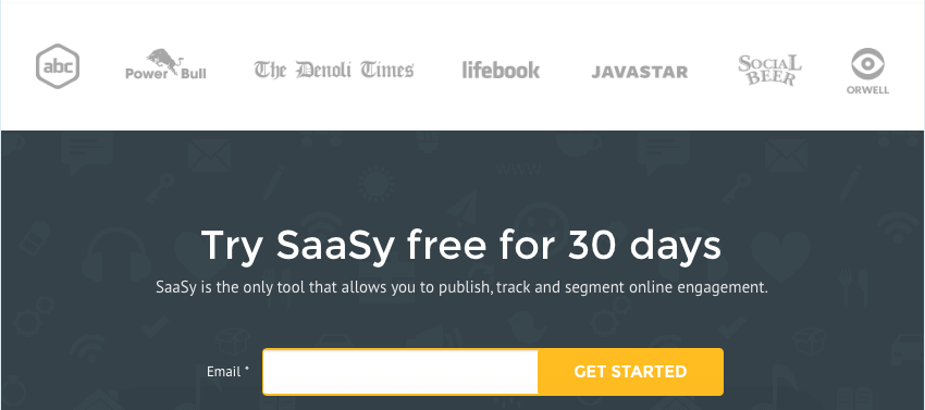
“Warming” prospects up to your offering before you push them deeper into your sales funnel to:
- Purchase your product or service online.
- Become a customer or subscriber of your online business.
- Employ any of the lead capture uses listed above, if you want to use an introductory page before sending them on to the landing page with your lead generation form.
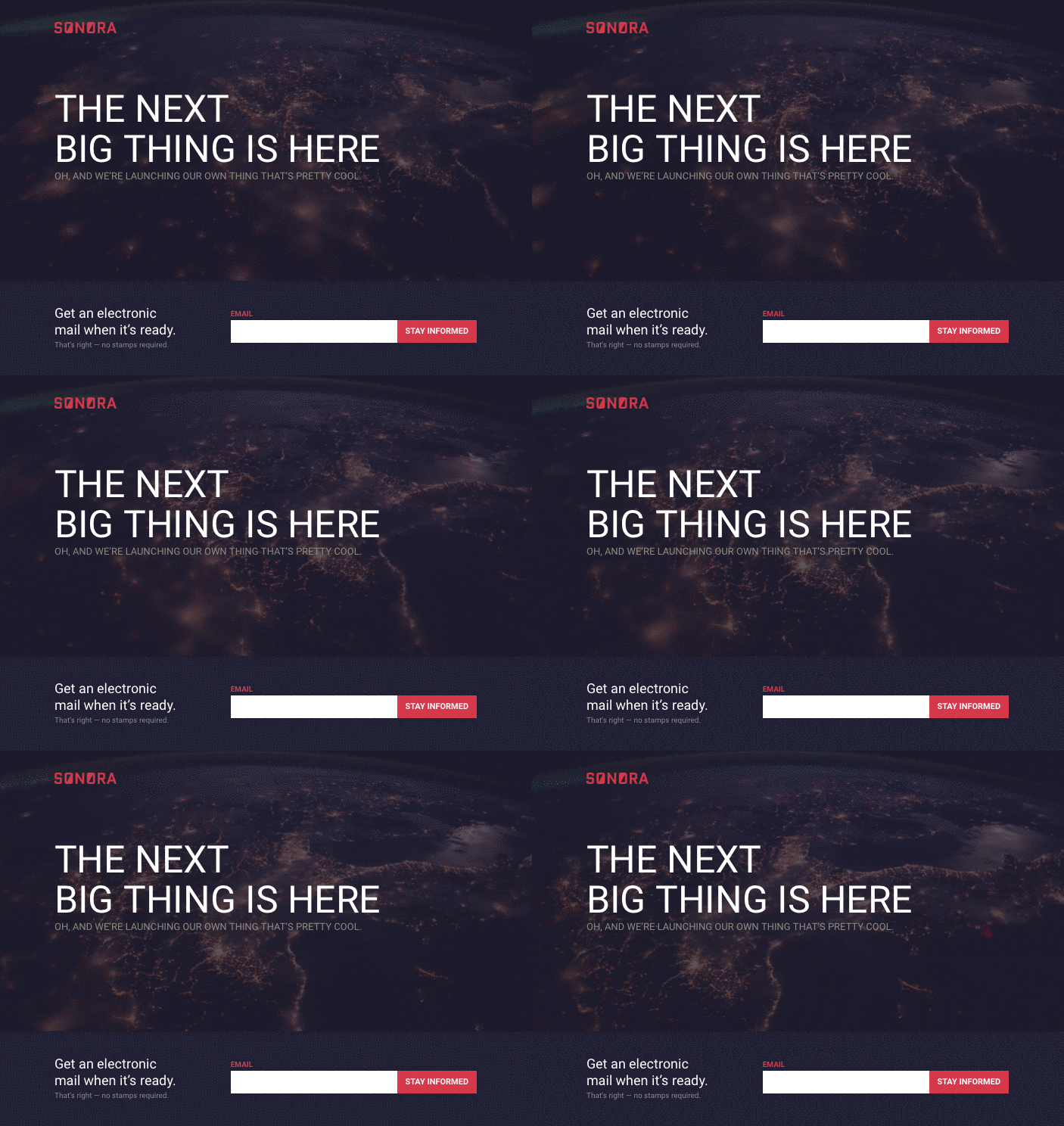
Why App Landing Pages Are Different
Not all landing pages are the same. As demonstrated above, there are several different types of landing page. For mobile apps you’ll need to focus visitor attention around the mobile app itself, giving a full overview of its core possibilities and why users should download your app (if this is your core action point).
Decide on action steps that you want particular landing page visitors to make – like leaving his/her contact details, or downloading your app – and design the landing page in accordance with these particular actions.
List of services for building mobile app landing pages:
- Squarespace – one of the most popular and best landing page builders, but needs to be customised for mobile app landing;
- Unbound – templates offer plenty of opportunities to delight your mobile audience with video demos and product snapshots;
- Instapage – has great app templates + lot of useful integrations;
- Lead pages – has app landing pages templates + free tutorials/webinars.
Why You Should Grow A User Base Before Launching Your App
You have built your app. You and your team love everything about it. What’s next? The reality.
Even if download rates show some interest in your app, the chances of people discovering it organically are close to zero. So to get your first thousand users you need to prepare for the launch and follow it through with an effective campaign.
Prepare For The Launch
The big launch of your full app website should coincide with the reveal of your app. Once your app goes live you should provide all the relevant details, including support and documentation, pricing, press kit, and a link to download in the app stores.
You’ll continue to add more information to your site until it eventually includes reviews, user testimonies, more in-depth previews, and links to articles about your app. But be very specific in your messaging.
Message match
Most visitors are impatient and will leave your page within a few seconds of arrival if you don’t reinforce their intent with a matching headline and purpose.
This example shows a comparison of good and bad message match on a landing page used for a pay-per-click campaign:

Spread the word
Once you have your app landing page ready, it’s time to attract some people to it. You’ll need to entice the relevant visitors – those who will be most likely to perform actions you want them to perform on your app landing page.
Think about the diversification of traffic sources: referral, social, direct, search, email, and of course paid traffic.
4 Easy Tactics to Get More From Your App Landing Page:
- Waitlist – mailing list of people who want to be in touch with you when your app launches;
- Surveys – a great way to collect feedback from your customers while developing a product;
- Social media channels – use them to create a place for people to gather and discuss your app, place where you can talk with your customers;
- A/B testing – act of running a simultaneous experiment between two or more pages to see which performs or converts the best.
Waitlist
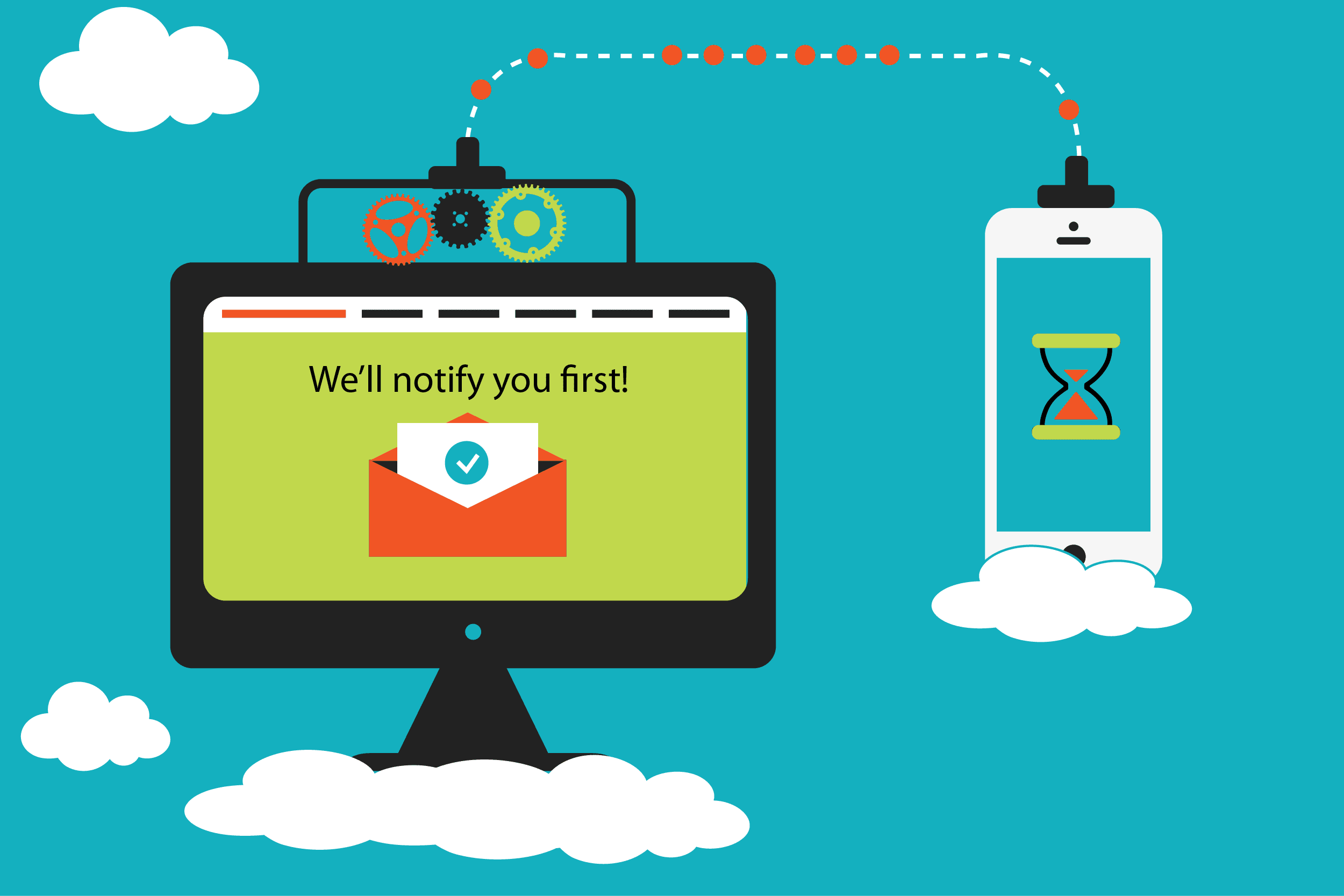
Waitlist is mailing list of people who want to be in touch with you when your app launches. With wait list you can keep people informed, sending the AppStore download link to those who were waiting for the initial app launch. In addition, you can gain feedback on initial app designs through surveys.
Usually this feature is integrated in the most popular services for building landing pages.
Surveys
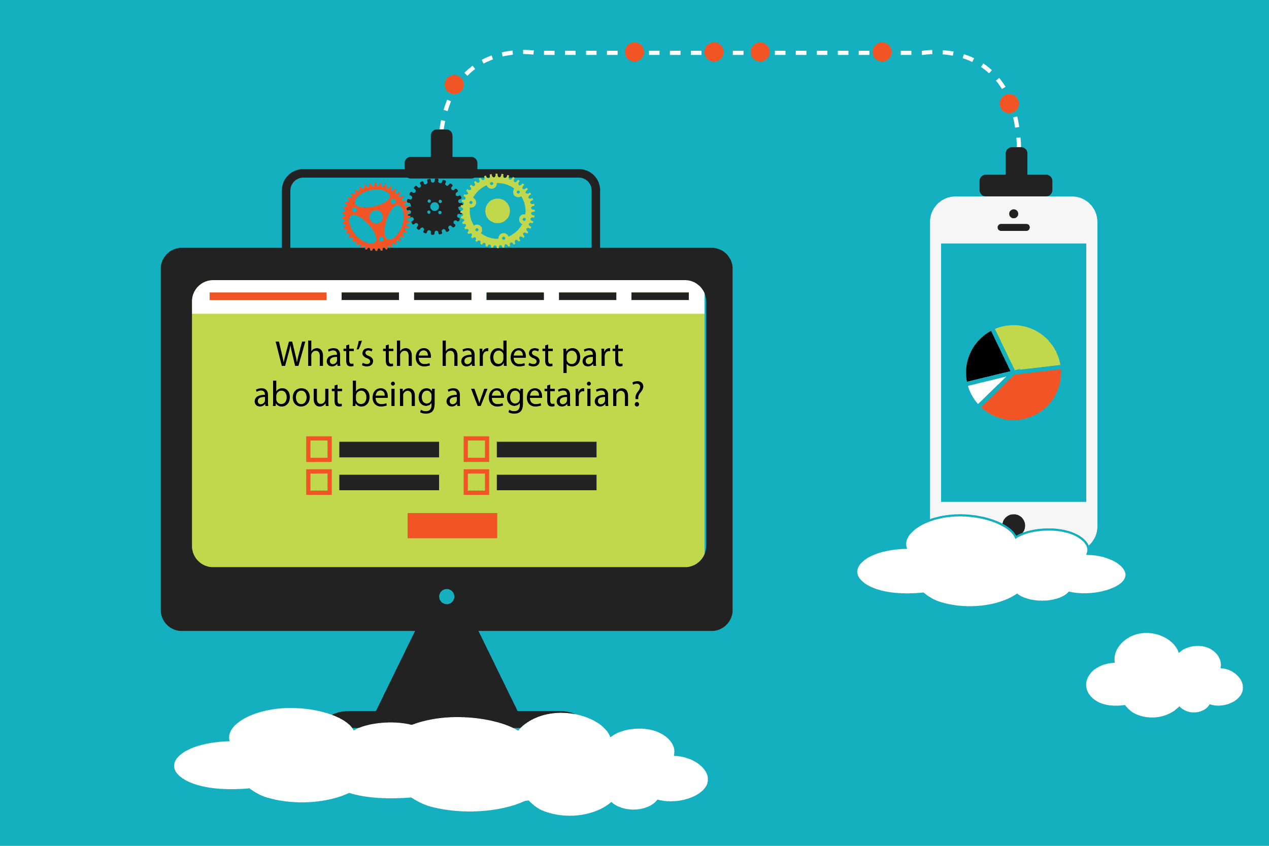
The next stage of your app landing page is about increasing interest by revealing more about your app and actively reaching out to potential users for app feedback. You can begin to introduce more details about your app’s features, a few screenshots, and additional materials as your app takes form.
Typeform or SurveyMonkey should work perfectly for that.
Use Social Media Channels
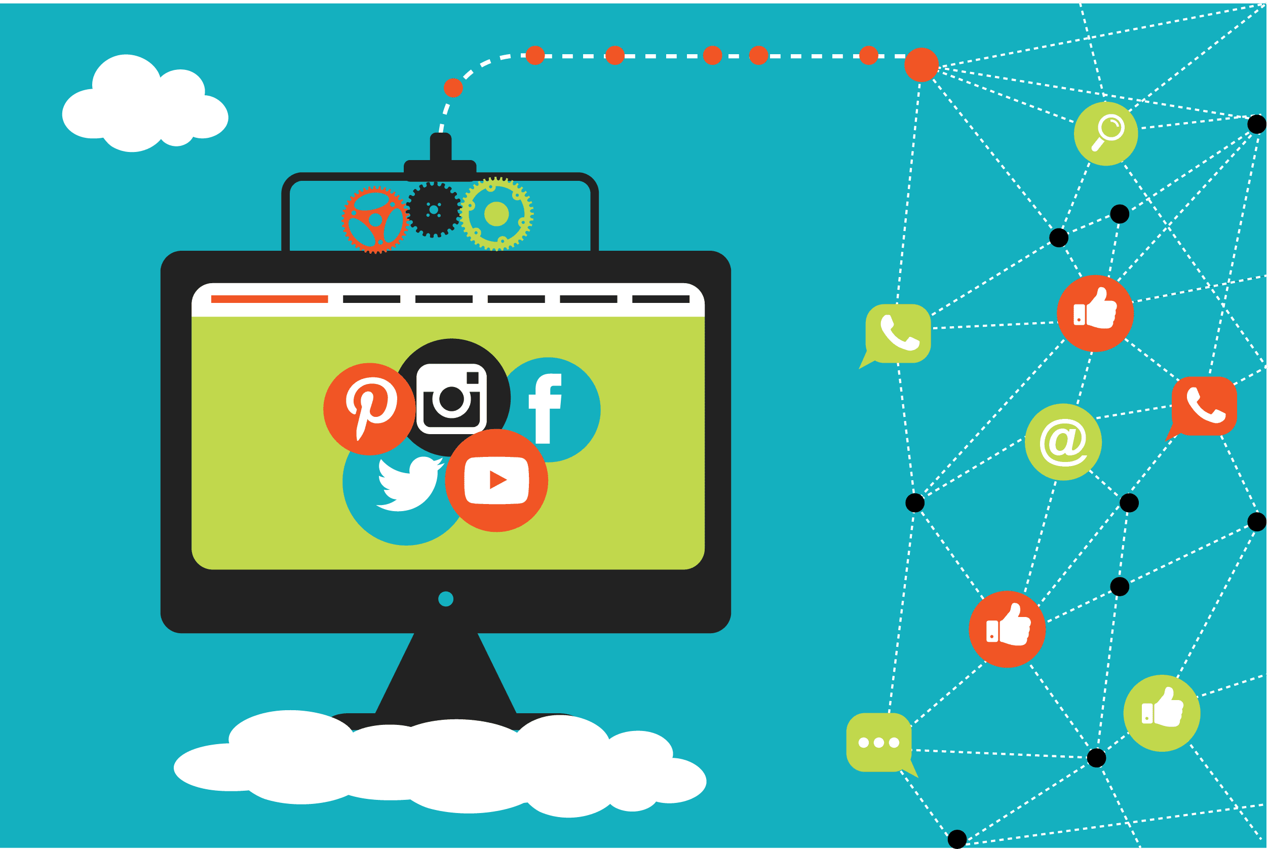
At the same time, you should also start building up your social media channels. People will need a place to gather or get info about new features/updates. Social media can be fun, but it’s tricky when you’re using it for business.
First of all, try those social media channels where you think your target audience hangs out. Next measure the effect you get from each channel and try to create more engaging content, but only for those that are showing better efficiency.
And don’t forget to mention links to your company’s social presence on your app landing page 😉
You can even take it one step further by incorporating tools like SumoMe‘s social sharing badge to enable users to share your app landing page with their own networks. When using this tool, try to think about why a particular user might want to share your page – this will help you to make your landing better. If you’re not sure about some of the elements required on a landing page, A/B are here to help.
A/B testing
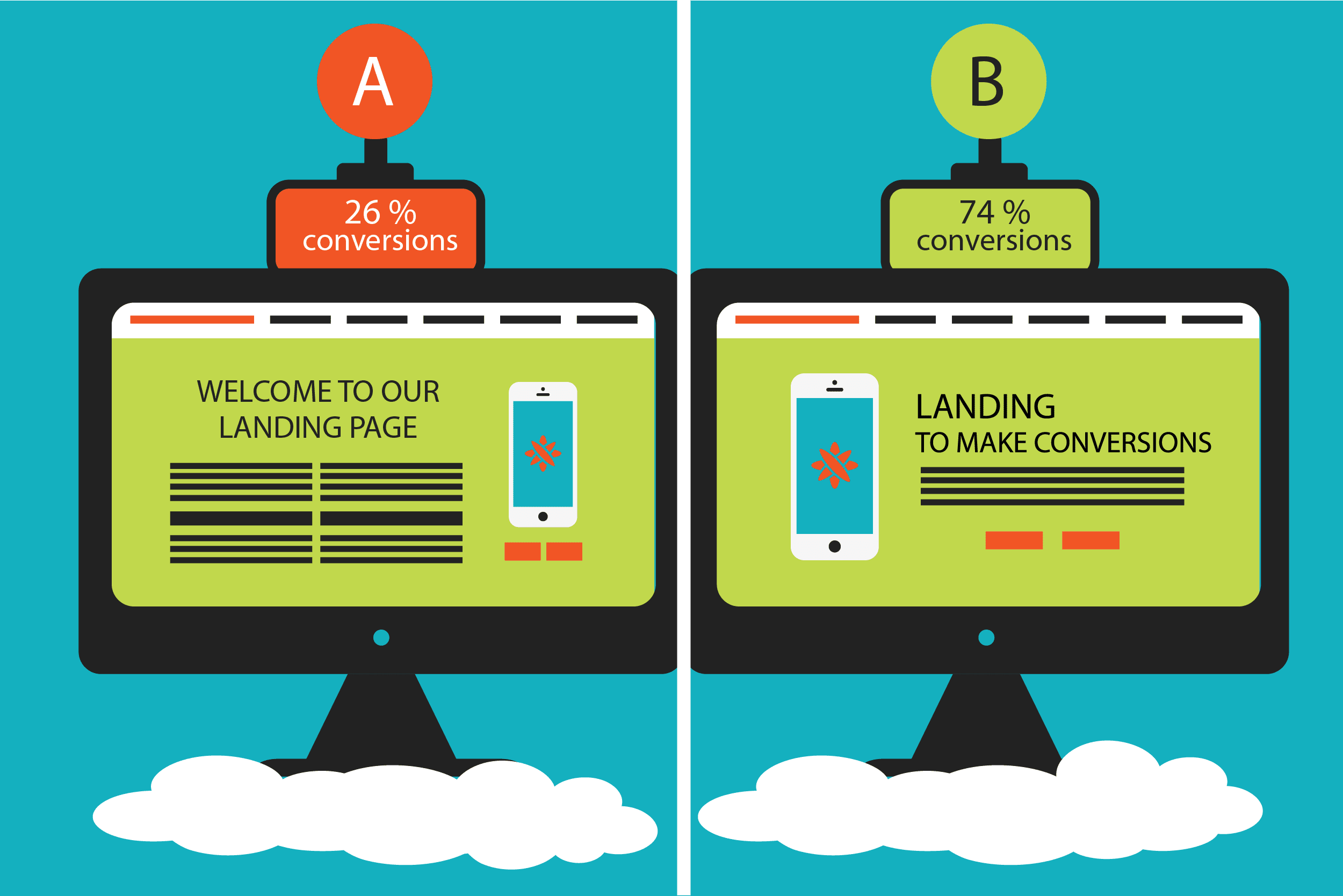
A/B testing is the act of running a simultaneous experiment between two or more pages to see which performs or converts the best. Running these tests will enable you to create the best possible version of your app landing page.
List of the things you can test on your landing page:
- Main headline
- The call to action (CTA) – typically the text that represents your page’s conversion goal.
- Hero shot (showing your product/app, could be a big photo/mockup)
- Button design. Use design principles to accentuate the appearance of your CTA (contrast, whitespace, size).
- Button color – green for go, blue for link color, orange or red for emotional reaction.
- Form length. For lead capture and other form usage, you will want to minimize the amount of fields that visitors are required to complete.
- Long copy vs. short copy.
And One More Thing..
Just a quick reminder, you’ll inevitably be building an app landing page, so please make sure your mobile app landing is displaying smoothly on the majority of smartphones. I’m sure that you’ll have at least 30% of people who will come to your page from their mobile devices and/or tablets.
[custom_form form=”form-inline-subscribe” topic=”Product”]
Summary
It’s doesn’t matter how big your idea is if the world doesn’t know about it. So make sure your business is visible by creating a website/landing page/app. Crafting a great landing page is quick and simple with the help of landing builders like Unbounce or Squarespace, but spreading the word is much more important than building, so make sure your priority is to inform people about your business.
If this article was useful to you, make sure to share it with your colleagues and friends.